Team Members
Name : sajen sarvajith k, Arnab Saha
Email : (Sajen) sajenjeshan1222@gmail.com, (Arnab) arnabsaha285@gmail.com
GitHub : (Sajen) https://github.com/sajenjeshan1222, (Arnab) https://github.com/encodeArnab
Telephone : (Sajen) +91 9150165487, (Arnab) +91 9625511367
Time Zone : Asia / Kolkata (GMT+5:30) - IST
Proposal Video Presentation
Motivation (sajen sarvajith)
My passion in deep learning, Natural Language Processing and documentation and my interest to work for an internationally reputed open source organisation made me apply for this Wechaty project.
Ideally this project will allow me the opportunity to utilize my experience gained as an Wechaty GSoD intern. I believe that there is no better place to continue my coding and documentation skills through this platform.
I consider it a vibrant experience to get the opportunity to meet mentors from all over the world and learn about new technologies. I am a very diligent and highly motivated student, and I am certain to push through with dedication. I have always worked to accomplish my goals and gain more knowledge and insight into quantum neural networks, deep learning and documentation. I will be able to contribute to this community in the best way I can.
Project Title
"Reconstruct Wechaty landing page with value propositions"
Synopsis
- Abstract
- Structure for the proposed documentation
- Task
- Expected Results
- Implementation/Approach
- Timeline
- Conclusion
- Additional Idea
Abstract
Most of the new users come to wechaty website by landing on the landing homepage. Unfortunately, the landing page is too simple and lacks enough information for new users, especially no value proposition. This problem leads to losing lots of new users, or making new users take more time to understand what wechaty can do and why we are the best.
In online marketing, landing pages are used to drive visitors towards conversion by getting them to click through to specific action. That action could be anything from encouraging users to make purchases on an online store or in our case to make use of wechaty or countless other actions. Whatever it is, there should be just one, clearly-defined CTA (call-to-action). As opposed to being a full-blown professional website, a landing page is a single page with a highly specific target: getting visitors to click through to our end goal.
This project aims to improve/reconstruct the wechaty homepage completely with value propositions. I think that landing page is the key of wechaty to attract more users because everytime when a user comes the first thing they see about wechaty is the landing page, so the landing page should be well designed, attractive and explain about the wechaty in a short, sweet and uncluttered manner.
Structure for the proposed documentation
- The proposed Structure of the Landing page is as follows:
- Introduction Section: Describe about Wechaty and various products and services it offers. It will also contain value propositions. Wechaty helps in creating a bot with just 6 lines of code! This is a strong point for attracting users to Wechaty.
- Recent Blogs: The section should include 2-3 recent highlighted blogs.
- User Experience: The landing page should contain a section for testimonials of the customers of Wechaty, so that customers are attracted. It can act as a powerful tool for persuasion.
- Use Cases: A section to demonstrate the various use cases to excite the developers and encourage them to try the product .
- Consist of a navbar to navigate to various sections.
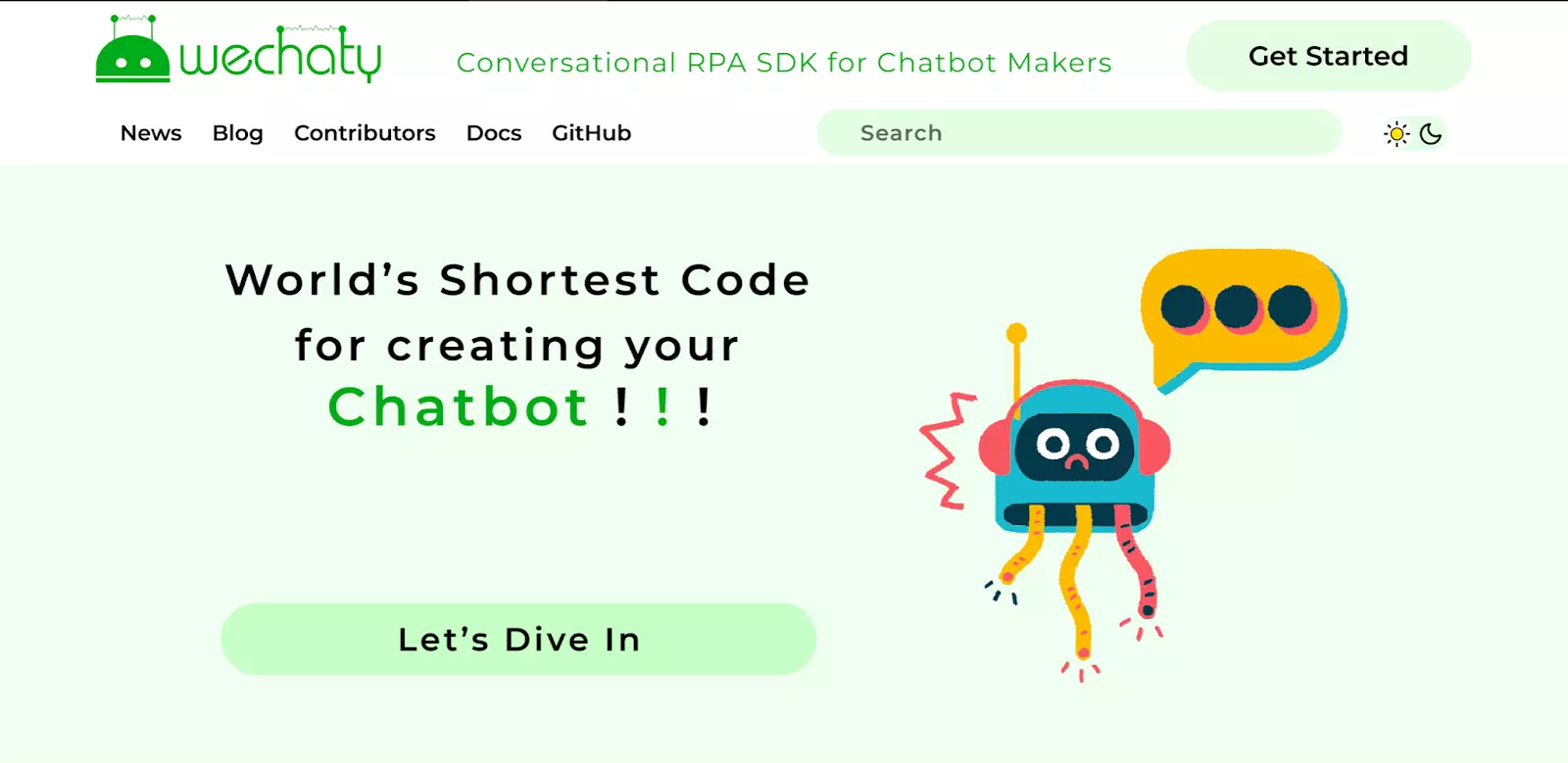
This is an example design for Wechaty Landing Page (as per available insights and can be changed based on mentor and community suggestions)

Complete Design can be viewed here
Task
- To reconstruct landing page with value propositions
- Identify all the benefits of wechaty offers
- Describe what makes these benefits valuable
- Identify our new users main problem
- Connect this value to our users problem
- Differentiate wechaty as the preferred provider of this value
Expected Results
- A clean and a well constructed landing page with value proposition
- This will have reconstruction plan and other details that is provided here
- Provide high-quality content that inspires confidence
- Make it easy to convert
- Have a flawless design
- Have a clear call to action
- Create eye catching headlines
- Contain engaging copy
- Make it about the visitors
- Make use of videos where appropriate
- Should be easy to scan at a quick glance
- Contain relevant, quality images
- Look gorgeous and act classy
- Broadcast users trust signals
- Have been through many rounds of testing
- Have conversion tracking turned on
Implementation / Approach:
Below explanation regarding the significant steps for this landing page with value proposition
Set Campaign Goal
- Every great landing page starts with a clear and measurable goal. This will help to figure out what element we need on wechaty landing page, how to write a copy, and the template we should use.
Write a Copy
- While most folks are eager to jump ahead and get designing, It's usually better to start with a copy first and I have planned to start with a copy. The unbounce conversion intelligence machine learning model has proven that landing page copy is twice as important to conversion rate as design.
Nail the Headline
- We've got less than 15 seconds to grab a visitors attention on our landing page this means headline is probably the most important thing
- I will make sure that it's memorable, clear, and solves the problem of wechaty visitors care about the most
Focus on Benefits
- Visitors want to hear about how wechaty solves its problems, how wechaty product will help make their lives easier, and why this will be benefit them.
- I will think think from the ideal visitor's perspective and list all the benefits of wechaty
Keep Simple
- In general, landing pages tend to convert better when they are easy to read and not overlay long
- I will built this landing page by complicated business jargon, keep the sentence short and try to cut out the unnecessary bits that wechat new visitors don't actually need on the page
Craft CTA
- The CTA (or call to action) is what we want our visitors to actually do on our landing page. This can take the shape of a form or a click-through button. Take some time to decide what action our visitors to take and the best we can do is convince them to take it.
- Make it specific
- While CTA buttons like "Learn More" or "Get Started" can work and they're also pretty vague. Visitors won't know what to expect when they click a button like that.
- I will be more specific and descriptive to get better results.
- Make it Simple
- All the things, words and explanations should be simple and clear to make wechaty users to understand easily
- Make it Singular
- The advantage of landing mage is that it eliminates all the other distractions we find on websites.
- I will give wechaty users only one path forward to take. Avoid featuring navigation links to other pages, headers, footers, or any other calls or action.
Select Images
- I will work on the visuals of the landing page. Start out by selecting what images we want to feature and check whether those are wechaty bot working images or custom illustrations
- Choose a Great Image
- The landing pages start out with big, beautiful images to show visitors what the wechaty is all about.
- Go for contributors over product
- I will include real photographs of our major contributors, people using wechaty and enjoying the wechaty on our landing page.
- These will help visitors connect with wechaty on a more personal and emotional level which will also make them more likely to convert
- This will make new users to make use of wechaty
- Visualize the benefits of wechaty
- I will look for more images to support the rest of our landing page
- Most visitors won't actually read every work that we write so i will be creative with different wechaty product and uses images or custom illustrations to help tell a visual story on the pages as well
Design Landing Page
- Start with the provided template. I will start constructing and add the necessary details that huan said in the blog post proposal
- The design of the page will focus on supporting the wechaty objective and nothing else. This also means that the web design will be clean and simple, so as to ensure a smooth browsing experience and not to compete for the viewers attention
Test and Optimize
- I will see what other improvements we can make. It's easy to test and optimize for a high conversion rate by seeing the results
- Duplicate the page
- Once the landing page is finished the heavy lifting is done. I will scale-up the production by duplicating the page and cheating a new variant and compare other variants then look for which is good and better
- Test New Elements
- I will try out different versions of our landing page headline. Switch up the images on our landing page
- Swap out a new CTA button. Each variant can help to test a new element in our wechaty landing page
Wechaty New Reconstructed Landing page
- In the terms of content, the new wechaty landing page has one simple message to convey. It promotes the desired action and sticks to explaining the benefits of performing this action.
- The ultimate goal of the new wechaty landing page is to make site visitors use wechaty, understand and click. Both the design and the text of the page need to reflect that, so i will make sure that all buttons are labeled with clear microcopy and that they stand out against the page's background
- This landing page is made up of one single page. Users can divide it into separate sections, but i will be stick to just one page that preferably isn't too long so that users can see and learn about wechaty easily
- Headers, subheaders buttons and images will be represented in a powerful and effective way, while ensuring that all elements remain cohesive.
Creating New Wechaty Landing Page
- Define the goal. I will pinpoint what our LP want to achieve and stay consistent throughout every detail of our wechaty site
- Create visual hierarchy. I will decide which elements are the most important and make them stand out.
- Generate action with a CTA. I will make it clear to our LP visitor what they should do. I will provide some call-to-action examples to our community members, mentors and volunteers then discuss about which look good
- Craft a captivating design. I will engage our wechaty site visitors with an eye-catching design that will make them want to click and discover more. I will also opt for a strategic layout.
Note :- "Most users don't scroll all the way to the bottom of the landing page. To make this landing page more effective and create the best user experience, I will place the design and content above the fold"
- Write killer copy. I will keep the text succinct and informative, with enticing headers that will give our wechaty visitors to read on
- Utilize images. I will set the tone and charm our visitors with impactful visuals. These can also help illustrate about wechaty in a clear way
- Highlight the value. I will let wechaty visitors know how clicking on the CTA will benefit them. Eg: like what will they get out of it ?
Short checklist for making new wechaty landing page
- Select a landing page template or design from scratch (I will design the template for the wechaty new LP so that it will be more efficient and new TW can improve our LP in future)
- Give the wechaty landing page an attractive name
- Add unique content
- Include striking images
- Include the value propositions and use eye catchy words for attraction
- Make sure all our wechaty link and CTAs are working
- Complete the meta description and SEO title
- Publish! New wechaty landing page with value proposition
Extra Tip:- One of the greatest advantages of landing pages is that they are relatively easy to make. Since this is easy to make I will create more than one landing page and test the performance of multiple designs. This technique will take our wechaty new landing page to a much more professional level. It can teach a lot about our wechaty audience and help us to focus on delivering a next level landing page for our wechaty users.
Conclusion
- An reconstructed landing page for wechaty with value proposition
- This will also have the reconstructing plan and other details that must be added in the new wechaty landing page as said here
- Make it one page
- I can divide wechaty landing page into separate sections, but stick to a single page.
- Prioritize above-the-fold content
- Because most visitors won't scroll all the way to the bottom of a landing page, place important content - such as our CTA - above the fold.
- Be clear and direct
- Include a strong headline across the top of the page. Visitors should understand within seconds what wechaty is offering, why it benefits them
- Focus on the 'how'
- I will make our landing page about our wechaty audience not just about wechaty. I will go beyond simply explaining what wechaty offering, instead I will focus on how wechaty benefit users
- Use strong CTA copy
- I will choose a short, direct, action-oriented phrase that tells visitors exactly what our visitors should do next
- Choose an eye-catching CTA button
- Make our website CTA visually prominent by placing it on a button. To instantly draw the eye of our visitors, opt for colors that make the button stand out from the rest of the content on the page
- Keep navigation to a minimum
- I will not overwhelm our wechaty visitors with multiple navigation choices because it may miss converting our users if we give them too many options.
- Instead all points on our landing page will lead to the same place of our CTA
- Use powerful visuals
- By using this I will grab our audience's attention with enticing and memorable visual elements, such as images and video
- Embrace with space
- While strategic visuals are key to a strong landing page, steer clear of packing in too many images, words, boxes, buttons, icons, clips art, videos and more.
- I will leave plenty of breathing room around the elements on our wechaty landing page to make content easy to read and digest
- Add social share buttons
- I will include social share buttons on our landing page to encourage visitors to spread the message and wechaty.
- Share button give additional exposure when our visitors repost our page on their own media feeds
- Include code of conduct of wechaty
- Thank you visitors sections
Additional Idea
Making our wechaty new landing page more effective
In order for the landing page to fulfill its purpose, we need to drive traffic to it. This can be done in a few different ways:
- Utilize the power of email marketing to send landing page to our wechaty subscribers via email
- Post a link to our LP on social networks like instagram or twitter
- Add a link to the LP within a blog post whenever someone add the blog post to our wechaty
- Optimize the wechaty landing page for search engines, by implementing advanced SEO features that can help wechaty website to boost the chance for getting found by organic (non-paid) search
- Create a PPC ad campaign on search engines and link to the landing page (If needed)
Timeline
This is the proposed timeline and can be modified by the mentor.
Week 1 (May 18 - May 24):
- This week we will take suggestions from the members and mentors to get various insights.
- Working on the initial designs of the projects and seeking suggestions.
- Before the project timeline begins we will set up our development environment so that we can start the project as soon as possible this helps to provide a professional and improved quality of landing page
Week 2 (May 24 - May 31):
- Making a draft for the landing page based on suggestions.
- Creating a landing page as per designs by using HTML, CSS and JavaScript and other UI/UX tools
- We will combine and make a effective, attractive and eye catching design
Week 3 (June 1 - June 7):
- Continue working on the landing page.
- Creating all the sections for the landing page.
- Making the landing page responsive.
Week 4 (June 8 - June 14):
- Proofreading the existing website
- Create visual hierarchy
- Design and craft the CTAs accordingly
Week 5 First Month Evaluation (June 15 - June 21):
- Submitting the works done in the previous week
- Making and joining CTA to do action
- Crafting a captivating design
Week 6 (June 22 - June 28):
- Designing and utilizing powerful and attractive images/GIFs
- Highlighting the value and key benefits of wechaty
- Making value propositions and eye catching words
Week 7 (June 29 - July 5):
- Adding navigation and keeping it minimum
- Making visuals and value propositions more powerful
- Including code of conduct of wechaty
- Prioritizing above the fold content
- Adding the voice of our contributors and other necessary things as explained in the blog post here
- Including the upcoming work and the needed design/things as we explained in detail in our implementation/approach section of this proposal.
Week 8 (July 6 - July 12):
- Making headline and sub-headline more attractive and effective
- Describing the value of wechaty benefits in the landing page
- Differentiate wechaty as the preferred provider of this value
Week 9 Second Month Evaluation (July 13 - July July 19):
- Submitting the work done in previous weeks
- Fixing minor typos and making changes to the webpage.
- Work on improvements suggested by the mentor
- Finishing the project completely and submitting the final results
- In the upcoming week we will be attached to the community and we will analyse/monitor the website traffic and if there is any improvements must be done or any suggestion we will do it and improve the quality of the work even more.
Biographical Information (sajen sarvajith)
I am a sophomore undergraduate student majoring in Computer Science from India. I have acted as a resource person on topics like ML, DL and orientation on online course awareness in colleges and universities. I have also organised and taken a few webinars regarding machine learning during COVID-19 pandemic.
I am passionate about making interactive tutorials, documentation and deep learning. I have worked on projects regarding R-CNN, LSTM and deep learning in my university. I am familiar working with JS/typescript and popular frameworks like angular, react, node.js, django and flask, I will also do UI development and documentation and I have writing experience by working in paper publications.
I am good with popular machine learning libraries like TensorFlow, PyTorch, keras, SciKit Learn, pandas, numpy, matplotlib. I have cracked the qualifier round of google code jam 2020, completed the Google Code-in competition in 2017 and completed hacktoberfest 2020 which are regarding open source.
I have worked on two paper publications regarding anomaly detection and quantum machine learning algorithms. I am going to publish in Elsevier and ICLR journals respectively due to this pandemic. I am unable to go to my university AI lab to complete my final tests so my publications have been paused for now.
Biographical Information (Arnab Saha)
This is Arnab Saha, currently living in Noida, Uttar Pradesh, India. I am a Sophomore undergraduate student pursuing Electronics and communications engineering from NIT, Hamirpur. I am a front-end developer and a graphics designer.
These are the designs I have made for various projects (I have also developed complete websites for most of them).
Prijour- The project was a website that consisted of a digital diary, an emotion predictor quiz and a happiness predictor model.
Website Link: here
Handouts - This project is a decentralised website for NGO crowdfunding.
Kurakoo - This project was a general purpose question and answer website.
Real Estate Corp - This is the landing page for a real estate organisation.

 Google Season of Docs 2021 Team Proposal: How-to Guides