Documentation Structure
While documenting a software, the first thing you come across is how to structure the documentation. Similar to building a house, you begin by drawing the architecture of the building. With good documentation structure, the software will be more accessible. Users no longer have to undergo the “trial and error” phase, and could easily find the correct topic for their questions. In Wechaty project, the structure follows the Documentation system and is separated into four sections:
- Tutorials
- How-to guides
- Explanation
- Reference
| type | Tutorials | How-to guide | Reference | Explanation |
|---|---|---|---|---|
| oriented to | learning | a goal | information | understanding |
| must | allow the newcomer to get started | show how to solve a specific problem | describe the machinery | explain |
| its form | a lesson | a series of steps | dry description | discursive explanation |
| analogy | teaching a small child how to cook | a recipe in a cookery book | a reference encyclopaedia article | an article on culinary social history |
According to the table, the first two sections (tutorials and how-to guide) focus more on practical steps. They provide clear instructions for the users to follow. On the other hand, the latter two sections (explanation and reference) focus more on theoretical knowledge. They provide background information about the software.
Tutorials
Tutorials teach users how to implement the software step by step. The target audience are those with no experience to the software. The users are passive, and they are waiting for you to feed them the knowledge they need to know when they are trying to use the software.
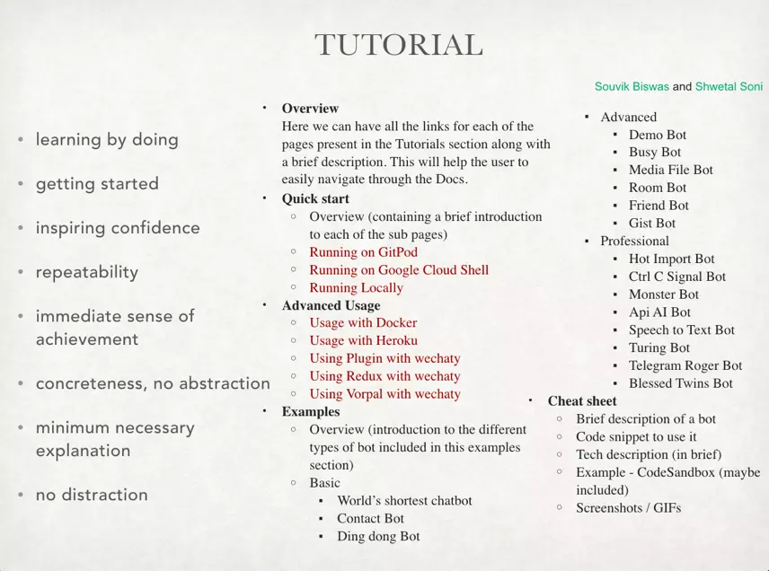
From the picture above, the left side with bulleted points is detailed guidance for documenting tutorials. By following the notice, you can avoid writing out of scope. The right side is the drafted structure proposed by team tutorials (Souvik Biswas and Shwetal Soni) in week 1. The topics that need to further discussed are highlighted in red.
The three highlighted topics under Quick start are similar to the topics proposed in project Explanation. In order to prevent overlapping, writers from team tutorials and team explanation will discuss about this part and refine their structures.
For the five highlighted topics under Advanced Usage, they more or less contradict the guides no distraction and inspiring confidence mentioned on the left side. For example, Usage with Docker aligns with Usage with Heroku. The users need to figure out which platform they are going to use first, and then select the corresponding topics. This step requires more prerequisites than using Wechaty requires. The users may be frustrated and give up learning Wechaty at the end. Documents in tutorials should take proactive actions. Instead of providing a lot of information, you should arrange the lessons with just engough knowledge for your readers.
How-to guides
The how-to guides is like a general Q&A. It acts as a supporting role, so each topic in this section is independent. The target audience are not expected to follow the sequence and should have enough knowledge to look for the guides they need.
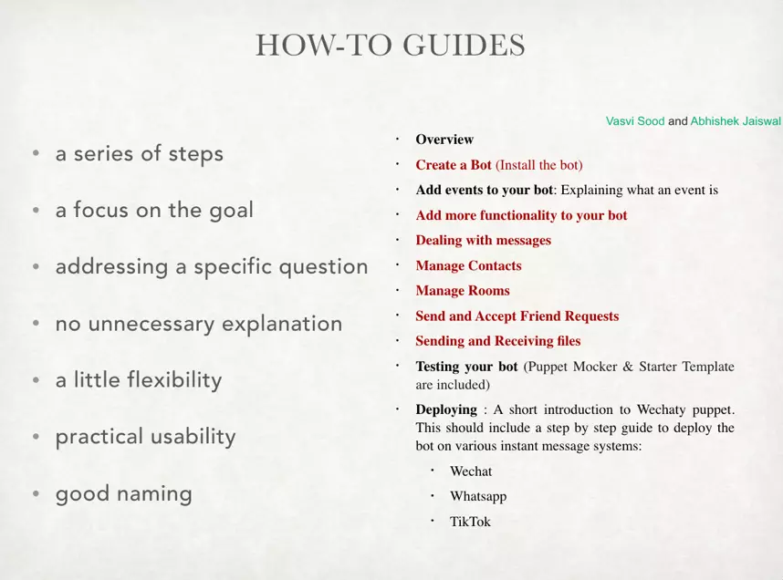
You can see the picture above. The left side with bulleted points provides information on how to write better how-to guides. With special emphasis on addressing a specific question or problem, topics in how-to guides can avoid overlapping with other sections, especially tutorials and reference. The right side is the drafted structure proposed by team how-to guides (Vasvi Sood and Abhishek Jaiswal) in week 1. The topics that need further discussion are highlighted in red.
The first two topics Creat a bot and Add more functionality to your bot seemed okay at first glance. However, the two topics violates addressing a specific question. Instead of addressing particular problems, the two topics are too general and are actually explaining concepts. They are better to be categorized as tutorials.
The rest of the topics highlighted in red are similar to the first two topics: they seemed perfect at first glance, but have to be carefully handled. In topics about messages, contacts, or rooms, writers will easily falling into the trap of listing down all functions, and try to explain as many as possible. This is out of scope. Instead of providing as many functions as possible, and telling users the software is very comprehensive, how-to guides are to fix specific questions. You don’t need to advertise or provide a dictionary here. The encyclopaedia thing should go into reference guides section.
Reference guides
You can view the reference guides as an encyclopaedia, or wiki. The users will not follow everything in the contents, and will only look for what they need. Therefore, the organization and accuracy of reference guides become very important. You need to make sure that users can easily find the information themselves quickly, and will not get bored and give up during searching.
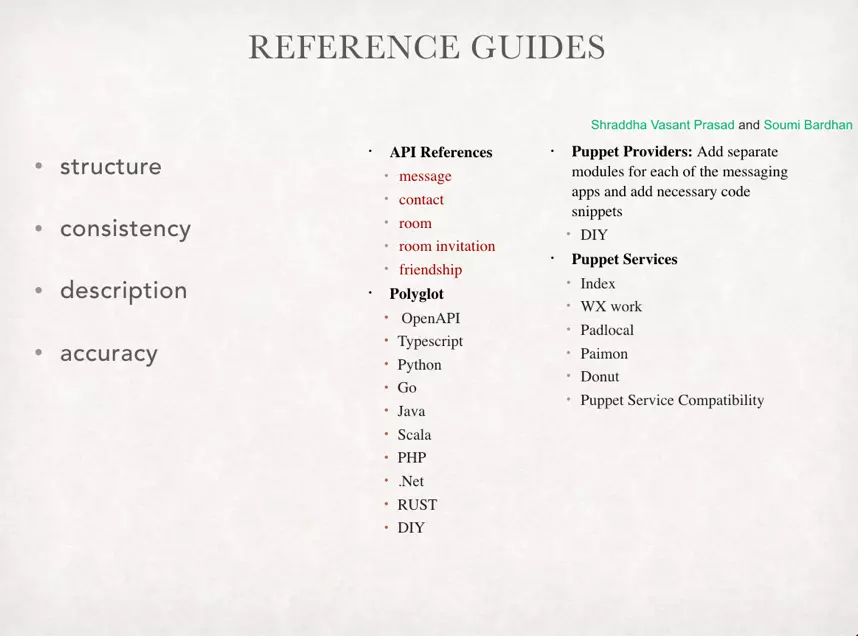
You can see the picture above. Same as the previous two sections, the left part with bulleted points tells you how to better construct reference guides, and avoid duplicated information with other sections. The right side is the drafted structure proposed by team reference guides (Shraddha Vasant Prasad and Soumi Bardhan) in week 1. The topics that need to pay more attentions are highlighted in red.
The highlighted topics under API reference should be careful when you are documenting. People might tend to do too much and provide instructions in these topics. In how-to guides, they also mentioned similar topics but with steps on teaching users how to do. Reference guides should stay on “do nothing but describe”. Leave out other opinions or explanations that could only be a distraction, and focus on clear and complete description.
Explanation
Explanation provides the background information of the software. The topics in here are not directly related with Wechaty, but are very helpful if you want to really master this software.
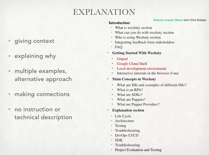
Just like the previous three sections, the guidelines of documenting explanation are listed in bulleted points on the left part. Focusing on providing the context, explanation section helps users to better understand what Wechaty is and the concepts of it. With the help of this section, users can not only know what they are doing, and also why they are doing.
The topics highlighted in red on the right side need to be tackled carefully. There are also similar topic names in tutorials. You should not mix these two sections together. Tutorials provide instructions on how to run the three topics while explanation explains them. Only three topics are highlighted because this section is rather unique. You don’t have to be so worry about as long as you don’t try to teach users how to do things.

 如何用paddlepaddle及wechaty制作熊猫头表情生成机器人